 Mathew K Analytics
Lesson 42 · Python for Data Science
2 - Seaborn- Countplot, Boxplot, Heatmap
In this lesson, we will learn about three popular Seaborn plot types: 1. Countplot - See category counts easily. 2. Boxplot - View how your data is spread…
- CoursePython for Data Science
- Lesson42 of 38
- Video12 min
- FormatJupyter notebook · 18 code cells
What you'll learn
Data
No separate download needed — the notebook creates or downloads everything it uses.
📓 Full notebook
Download .ipynb
Seaborn Basics: Countplot, Boxplot, and Heatmap#
In this lesson, we will learn about three popular Seaborn plot types:
- Countplot - See category counts easily.
- Boxplot - View how your data is spread out.
- Heatmap - Visualize complex data in grid form.
These help you explore your data fast. Let us dive in!
# First, let us import libraries we will use
import seaborn as sns
import matplotlib.pyplot as plt
import pandas as pd
What is Seaborn?#
Seaborn is a Python library for drawing attractive charts easily. It works well with Pandas and Matplotlib.
You can use it to quickly explore your data with just one line of code.
# Let us make some example data for the lesson
data = pd.DataFrame({"gender": ["female", "male", "female", "other", "male", "male", "female", "female"],
                     "grade":   ["A", "C", "B", "B", "A", "D", "C", "B"],
                     "score":  [90, 75, 82, 89, 93, 60, 72, 85]})
data
Countplot: Category Counts Made Easy#
A countplot shows how many times each category appears. This makes it easy to spot the most common group in your column.
# Show the count of each gender
sns.countplot(x="gender", data=data)
plt.title("Count of Each Gender in Class")
plt.show()

# Count grades with countplot
sns.countplot(x="grade", data=data)
plt.title("Grade Counts in Class")
plt.show()

# Use countplot with a different color palette
sns.countplot(x="grade", data=data, palette="Set2")
plt.title("Grades With Different Colors")
plt.show()

Boxplot: Seeing Data Spread and Outliers#
A boxplot shows how scores are spread out. It helps you spot medians, ranges, and unusual data points.
# Show score distribution with a boxplot
sns.boxplot(y="score", data=data)
plt.title("Distribution of Scores")
plt.show()

# Compare scores by gender with a boxplot
sns.boxplot(x="gender", y="score", data=data, palette="pastel")
plt.title("Scores by Gender")
plt.show()

Heatmap: Visualizing Data in a Grid#
A heatmap uses color to show numbers in a table. It is great for showing patterns when you have many values.
# See pairwise correlations with heatmap
corr = data.corr(numeric_only=True)
sns.heatmap(corr, annot=True, cmap="YlGnBu")
plt.title("Correlation Heatmap")
plt.show()

# Create a fake grid of temperatures to plot as a heatmap
temps = pd.DataFrame([[20, 22, 21], [19, 23, 20], [21, 22, 24]],
                     columns=["Morning", "Noon", "Evening"],
                     index=["Monday", "Tuesday", "Wednesday"])
sns.heatmap(temps, annot=True, fmt="d", cmap="coolwarm")
plt.title("Weekly Temperatures")
plt.show()

# Handle missing data safely with heatmap
temps.loc["Thursday"] = [22, None, 19]
sns.heatmap(temps, annot=True, fmt="g", cmap="YlOrRd")
plt.title("Temperatures Including Missing Day")
plt.show()

Mini-Project: Quick Grade Report#
Let us bring together countplot, boxplot, and heatmap for a student grade report.
We will build a quick interactive experience.
# Collect a few student grades from user
students = []
grades = []
scores = []
for i in range(3):
    name = input("Student name: ")
    grade = input("Grade (A-D): ")
    score = int(input("Score (0-100): "))
    students.append(name)
    grades.append(grade)
    scores.append(score)
grade_df = pd.DataFrame({"student": students, "grade": grades, "score": scores})
grade_df
# Use countplot, boxplot, and heatmap on your mini data
sns.countplot(x="grade", data=grade_df)
plt.title("Mini Grade Count")
plt.show()
sns.boxplot(y="score", data=grade_df)
plt.title("Mini Scores Spread")
plt.show()
sns.heatmap(grade_df[["score"]].T, annot=True, cmap="YlGn")
plt.title("Scores Heatmap (Rows: Students)")
plt.yticks([0], ["score"]); plt.show()


# TIP: Fast data check with .info() and .describe()
print(grade_df.info())
print(grade_df.describe())
# Common error: Misspelled column or typo
# print(grade_df["scorre"])  # This line has a typo
# Bonus: Switch Seaborn style for better looks
sns.set_style("whitegrid")
sns.countplot(x="gender", data=data)
plt.title("Gender Count with Whitegrid Style")
plt.show()

# Advanced: Heatmap with bigger numbers and annotations
import numpy as np
np.random.seed(1)
big_data = pd.DataFrame(np.random.randint(10, 90, size=(5, 5)),
                       columns=["A", "B", "C", "D", "E"])
sns.heatmap(big_data, annot=True, linewidths=1, fmt="d", cmap="viridis")
plt.title("Big Heatmap Example")
plt.show()

Recap: What Did We Learn?#
- Countplot: Fast look at category counts
- Boxplot: Quick view of how numbers spread out
- Heatmap: See lots of values in a single grid
Seaborn lets you visualize your data fast, and its plots work great for real-world tables.
Thanks for Watching! Try More and Join Us#
Keep practicing Seaborn plots as you learn more about data. Like this video if you found it helpful. Subscribe for more beginner-friendly lessons. Leave a comment about what you want to learn next!
Happy coding!
Found this useful?
All lessons, notebooks and datasets here are free. If they helped you, a coffee keeps new lessons coming.
Related lessons
 15 min
Understanding Data Correlation and Heatmap Visualization Using Python and Pandas
 13 min
Understanding Heatmaps and Correlation Matrices with Seaborn for Data Analysis
 12 min
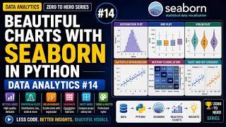
Beautiful Charts with Seaborn in Python | Data Analytics #14
 45 min