Mathew K Analytics

Data visualisation in python

A free 34-lesson course. Every lesson has a video walkthrough and a Jupyter notebook you can download or open in Google Colab; 1 lessons include real datasets. Tools covered: pandas, Matplotlib, NumPy, seaborn, Plotly, statsmodels.
How to Set Up Python and Jupyter Notebook for Data Visualization Beginners12 min
Lesson 3

How to Set Up Python and Jupyter Notebook for Data Visualization Beginners

📓 Notebook · pandas · Matplotlib

Understanding NumPy Arrays and Random Data Generation for Data Analysis in Python11 min
Lesson 4

Understanding NumPy Arrays and Random Data Generation for Data Analysis in Python

📓 Notebook · NumPy · pandas · Matplotlib

Master Data Cleaning and Preparation with Pandas in Python for Effective Bible Study Analysis14 min
Lesson 6

Master Data Cleaning and Preparation with Pandas in Python for Effective Bible Study Analysis

📓 Notebook · statsmodels · pandas · Matplotlib

Introduction to Matplotlib: Creating and Customizing Line and Bar Plots in Python14 min
Lesson 8

Introduction to Matplotlib: Creating and Customizing Line and Bar Plots in Python

📓 Notebook · Matplotlib · pandas · NumPy

How to Create and Customize Scatter Plots and Histograms in Matplotlib15 min
Lesson 9

How to Create and Customize Scatter Plots and Histograms in Matplotlib

📓 Notebook · pandas · Matplotlib · NumPy

How to Customize Titles, Labels, and Legends in Matplotlib for Clearer Data Visualization12 min
Lesson 10

How to Customize Titles, Labels, and Legends in Matplotlib for Clearer Data Visualization

📓 Notebook · Matplotlib · pandas

Mastering Subplots and Multiple Axes in Matplotlib for Effective Data Visualization14 min
Lesson 11

Mastering Subplots and Multiple Axes in Matplotlib for Effective Data Visualization

📓 Notebook · Matplotlib · pandas

Enhancing Matplotlib Plots: Mastering Colors, Markers, and Line Styles in Python15 min
Lesson 12

Enhancing Matplotlib Plots: Mastering Colors, Markers, and Line Styles in Python

📓 Notebook · Matplotlib · pandas

How to Save and Export High-Quality Matplotlib Plots for Publication and Presentation15 min
Lesson 13

How to Save and Export High-Quality Matplotlib Plots for Publication and Presentation

📓 Notebook · Matplotlib · pandas

Introduction to Seaborn for Data Visualization with Built-in Python Datasets10 min
Lesson 14

Introduction to Seaborn for Data Visualization with Built-in Python Datasets
📓 Notebook · seaborn · pandas · Matplotlib

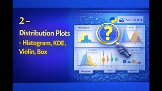
Understanding Distribution Plots in Python: Histogram, KDE, Violin, and Box Plots Explained11 min
Lesson 15

Understanding Distribution Plots in Python: Histogram, KDE, Violin, and Box Plots Explained

📓 Notebook · pandas · Matplotlib · seaborn

Visualizing Categorical Data in Python with Seaborn: Bar, Count, and Swarm Plots11 min
Lesson 16

Visualizing Categorical Data in Python with Seaborn: Bar, Count, and Swarm Plots

📓 Notebook · pandas · seaborn · Matplotlib

Understanding Relationship Plots in Seaborn: Scatter, Regression, and Pairplot Explained14 min
Lesson 17

Understanding Relationship Plots in Seaborn: Scatter, Regression, and Pairplot Explained

📓 Notebook · pandas · Matplotlib · seaborn

Understanding Heatmaps and Correlation Matrices with Seaborn for Data Analysis13 min
Lesson 18

Understanding Heatmaps and Correlation Matrices with Seaborn for Data Analysis

📓 Notebook · statsmodels · pandas · seaborn

Mastering Custom Themes and Aesthetics in Seaborn for Clear Data Visualization10 min
Lesson 19

Mastering Custom Themes and Aesthetics in Seaborn for Clear Data Visualization

📓 Notebook · pandas · seaborn · Matplotlib

How to Use Annotations and Highlights to Enhance Data Visualization in Plots14 min
Lesson 20

How to Use Annotations and Highlights to Enhance Data Visualization in Plots

📓 Notebook · Matplotlib · pandas · NumPy

Master Customizing Axes in Python: Ticks, Scales & Logarithmic Transformations12 min
Lesson 21

Master Customizing Axes in Python: Ticks, Scales & Logarithmic Transformations

📓 Notebook · pandas · Matplotlib · NumPy

Creating Interactive Dashboards by Combining Multiple Plots for Effective Data Visualization11 min
Lesson 22

Creating Interactive Dashboards by Combining Multiple Plots for Effective Data Visualization
📓 Notebook

Best Practices for Data Storytelling Using Visuals in Bible Teaching | Week 07–0812 min
Lesson 23

Best Practices for Data Storytelling Using Visuals in Bible Teaching | Week 07–08

📓 Notebook · pandas · Matplotlib

Introduction to Plotly: Creating Interactive Charts with Python10 min
Lesson 24

Introduction to Plotly: Creating Interactive Charts with Python

📓 Notebook

Creating Interactive Scatter, Line, and Bar Charts with Plotly in Python11 min
Lesson 25

Creating Interactive Scatter, Line, and Bar Charts with Plotly in Python

📓 Notebook · Plotly · pandas

Interactive Data Filtering in Bokeh: Building Dynamic Visualizations with Python14 min
Lesson 27

Interactive Data Filtering in Bokeh: Building Dynamic Visualizations with Python

📓 Notebook · Bokeh · pandas

Introduction to GeoPandas: Working with Shapefiles and Geospatial Maps in Python10 min
Lesson 29

Introduction to GeoPandas: Working with Shapefiles and Geospatial Maps in Python

📊 Dataset · 📓 Notebook · GeoPandas · pandas · Matplotlib

Creating Interactive Choropleth Maps with Plotly for Python Geospatial Visualization13 min
Lesson 30

Creating Interactive Choropleth Maps with Plotly for Python Geospatial Visualization

📓 Notebook · statsmodels · Plotly · pandas

3 - Interactive Maps with Folium14 min
Lesson 31

3 - Interactive Maps with Folium

📓 Notebook · Folium · statsmodels · pandas

Geospatial Analysis Case Study: Mapping and Visualizing Real-World Location Data14 min
Lesson 32

Geospatial Analysis Case Study: Mapping and Visualizing Real-World Location Data

📓 Notebook · pandas · Matplotlib · datetime

4 - Advanced Dash - Layouts, Callbacks, Hosting15 min
Lesson 36

4 - Advanced Dash - Layouts, Callbacks, Hosting

📓 Notebook · Dash · Plotly · pandas

Visualizing Network Graphs with NetworkX and PyVis in Python10 min
Lesson 37

Visualizing Network Graphs with NetworkX and PyVis in Python

📓 Notebook · NetworkX · Matplotlib · pandas

Time Series Visualization Techniques Using Matplotlib and Plotly in Python14 min
Lesson 38

Time Series Visualization Techniques Using Matplotlib and Plotly in Python

📓 Notebook · pandas · Matplotlib · Plotly

Creating 3D and Animated Data Visualizations in Python with Matplotlib and Plotly14 min
Lesson 40

Creating 3D and Animated Data Visualizations in Python with Matplotlib and Plotly

📓 Notebook

Master Visual Design Principles for Effective Communication in Python Data Visualization11 min
Lesson 41

Master Visual Design Principles for Effective Communication in Python Data Visualization
📓 Notebook · pandas · Matplotlib

2 - Case Study Project - Sales and Marketing Dashboard10 min
Lesson 42

2 - Case Study Project - Sales and Marketing Dashboard

📓 Notebook · pandas · Matplotlib

Climate Data Analysis & Geospatial Visualization: Expert Case Study Techniques9 min
Lesson 43

Climate Data Analysis & Geospatial Visualization: Expert Case Study Techniques

📓 Notebook · pandas · Matplotlib · NumPy

Build an Interactive Data Visualization App: Capstone Project Step-by-Step Guide13 min
Lesson 44

Build an Interactive Data Visualization App: Capstone Project Step-by-Step Guide

📓 Notebook · pandas · Matplotlib · Plotly